“行高”即CSS中line-height所描述的属性,它表示两行文字间基线之间的距离,不允许使用负值。在弄清行高之前,我们先来了解几个概念:
顶线、中线、基线、底线
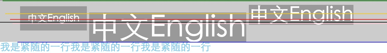
上图所示线条从上到下为:1
2
3
4
5
6
7
8
9
10<style>
vertical-align:top; /*顶线*/
vertical-align:text-top;
vertical-align:super; /*上标*/
vertical-align:middle; /*中线*/
vertical-align:baseline; /*基线*/
vertical-align:sub; /*下标*/
vertical-align:bottom; /*底线*/
vertical-align:text-bottom;
</style>
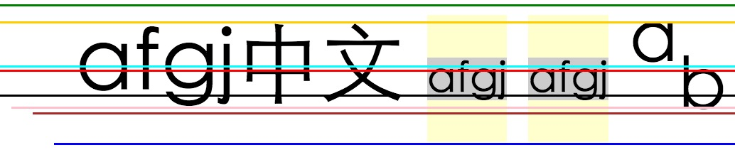
行距 、半行距、内容区、inline-box、line-box、line-height
下图从上到下分别是顶线,中线,基线,底线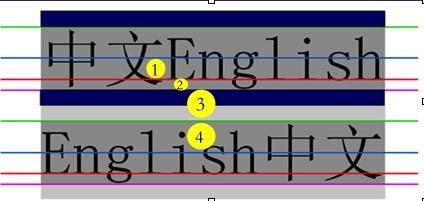
行距:底线到下一文本行顶线之间的垂直距离(行高与字体的差),即图中3所示区域;
半行距:行距/2;
内容区:顾名思义是内容显示区,由底线(bottom)与顶线(top)包裹,其高度等于字体大小,即图中1+2+4所示区域;个人认为此处形容不太准确,应该描述为由text-top与text-bottom包裹
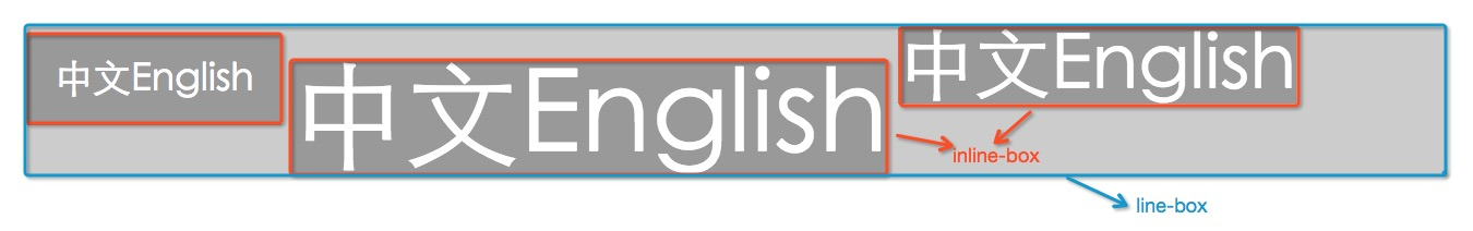
inline-box:
1,每个行内元素都会生成一个inline-box,inline-box是一个浏览器渲染模型中的一个概念,无法显示出来;
2,在没有padding影响的时候,inline-box的高度等于内容区的高度;有padding时,inline-box的高度等于font-size+padding-top+padding-bottom;
3,设定行高时,inline-box高度不变,内容区域上下两边分别增加一个半行距(图中蓝色区域)。
line-box:
1,指本行的一个虚拟的矩形框,也是浏览器渲染模式中的一个概念,无法实际显示;
2,当有多行时,每一行都会有一个line-box,且line-box不会重叠;
3,在没有margin等的影响的时候,line-box从上到下一个接一个的紧密排列;
4,line-box的高度是最上盒顶部到最下盒底部的距离,(保证足以容纳它所包含的所有inline-box);
5,对于一个非替换内联元素,行高指的是line-box的计算高度。
The line box height is the distance between the uppermost box top and the lowermost box bottom.
line-height:
其实,行高存在的主要意义就是影响line-box的布局,懵逼吗?来,上代码:
1 | <div style="background-color:#ccc;font-family:'Microsoft Yahei';color:white;"> |
此时没有为父容器div设置行高,行高默认是能包裹所有inline-box的最小高度(灰色背景区)
为div设置行高:line-height:20px;

可以看到line-box(浅灰色部分)收缩了,文字也发生了重叠,而且文字顶部紧跟着浅灰色背景的底部。
以下言论是笔者根据上面的一些概念自己折腾总结出来的,有些不准确,还望各位大牛牛指正
font-size大小就是内容区的高度大小,font-size的大小决定text-top到text-bottom之间的位置,一旦font-size属性确定,text-top与text-bottom的位置就会被确定;
line-height的大小就是line-box的大小,即line-height的大小决定顶线与底线的位置,一旦行高确定,top与bottom的位置就确定了。top一定不能低于text-top的位置,bottom一定不能高于text-bottom的位置;
当line-height的值小于font-size的值时,top与bottom线的位置由font-size决定而不由line-height决定在此情况下,top与text-top,bottom与text-bottom重合。inline-box与line-box就只有一个”in”的区别,很容易就懵逼,只要记住:inline-box是针对每个
行内元素,而line-box是针对每一行,line-box包裹处在同一行的inline-box
行高的应用
行高最广泛的应用,就是实现单行文字和多行文字的垂直居中:
- 为父容器设置line-height或者font-size,确定各条线的位置;
- 设置vertical-align属性对齐即可,该属性影响在line-box中的inline-box的垂直位置。
对齐规则
一旦六线谱确定了,根据对齐规则就可以随心所欲的设置文字的位置了( 翻译自W3C规范):
1,以下的值仅仅对一个父内联元素或者父块容器盒有意义(此处理解为作为父元素的内联元素或作为父容器的块容器盒)
2,在下列定义中,对于一个行内级非可替换元素,参照对齐的box的高度是line-height,其他对齐的box是margin box
- baseline:
box的baseline与parent box的baseline对齐;
如果该box没有baseline(why?),则该box的底外边缘与parent box的baseline对齐;- middle:
box的垂直中点与parent box的基线与parent box中小写字母x高度的一半的和对齐;- sub:
Lower the baseline of the box to the proper position for subscripts of the parent’s box. (This value has no effect on the font size of the element’s text.)
降低box的基线到合适的位置来作为parent box的下标;- super:
Raise the baseline of the box to the proper position for superscripts of the parent’s box. (This value has no effect on the font size of the element’s text.)
升高box的基线到合适的位置来作为parent box的上标;- text-top:
box的top与父容器的内容区的顶部对齐;- text-bottom:
box的bottom与父容器的内容区的底部对齐;
The following values align the element relative to the line box. Since the element may have children aligned relative to it (which in turn may have descendants aligned relative to them), these values use the bounds of the aligned subtree. The aligned subtree of an inline element contains that element and the aligned subtrees of all children inline elements whose computed ‘vertical-align’ value is not ‘top’ or ‘bottom’. The top of the aligned subtree is the highest of the tops of the boxes in the subtree, and the bottom is analogous.
大致意思是:top与bottom是相对于line box对齐,因为元素可能会有子元素相对于它对齐,所以top与bottom使用对齐子树的边界对齐。内联元素的对齐子树包括该元素和它所有内联子元素,并且这些内联子元素的vertical-align不能是top或者是bottom。对齐子树的顶部是所有子树中最高元素的顶部,底部是所有子树中最低元素的底部。
- top:
对齐子树的顶部与line box的顶部对齐;- bottom:
对齐子树的底部与line box的底部对齐;
特殊元素基线:
- inline-table的基线是table中第一行的基线。
- inline-block的基线是正常流中最后一个盒子的基线;如果处于非正常流中,inline-block的基线是外边距的底部。
现在对于文字垂直居中是不是有了信手拈来的感觉?
单行文字垂直居中:
在父容器的line-height确定的情况下,直接设置vertical-align:middle就可以了1
2
3<div style="line-height:100px;background-color:#ccc;">
<span style="vertical-align:middle;">This is a test.</span>
</div>
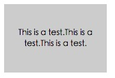
如果span里面内容太多,发生了换行,由于这多行内容还是在同一个内联元素中,因此这多行文字的基线仍然是第一行文字的基线。此时再用vertical-align:middle只能使第一行文字垂直居中,如何 实现多行文字的垂直居中?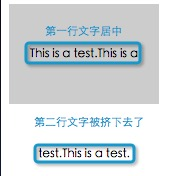
多行文字垂直居中:
再此之前,先来看看图片的垂直居中。
图片的垂直居中与单行文字的垂直居中类似,在父容器的行高确定的情况下,只需要设置vertical-align:middle就可以了1
2
3<div style="width:600px;line-height:100px;border:1px solid red;text-align:center;">
<img src="http://i1.sinaimg.cn/dy/deco/2013/0329/logo/LOGO_1x.png" alt="test test test" style="width:100px;height:50px;vertical-align:middle;border:1px solid red"/>
</div>
如果我们把这多行文字看成是一个图片,再利用图片的垂直居中不就可以了吗?
现在我们回忆一下img的特性:虽然是内联元素,但是可以设置宽高,这不就是inline-block的特点吗?
为此,我们需要为span设置display:inlne-block,vertical-align:middle: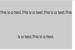
文字已经居中了,但是每行文字隔的太开了,这是因为line-height是继承属性,span在没有设置line-height的情况下会继承父元素的,因此需要为span设置一个line-height属性来约束这多行文字的行间距。1
2
3<div style="width:150px;line-height:100px;background-color:#ccc;text-align:center;">
<span style="display:inline-block;font-size:10px;vertical-align:middle;">This is a test.This is a test.This is a test.</span>
</div>